We’ve covered most of Ice-Bound‘s narrative system so far in our three-part post, ranging from how we make flexible story fragments to the combinatorial system that drives the sculptural quality of the narrative. Here are links, in case you’re just now coming across this:
1: General overview
2: Constructing Combinations
3: Shifting Story Text
For the last part of this “under the hood” overview, we wanted to talk about how we troubleshoot the narrative possibility space.
The Setup
As a refresher, each level in Ice-Bound has several symbols which can be activated and de-activated by the player, triggering a cascade of events and/or endings. That’s what we mean when we say Ice-Bound is a combinatorial narrative. Ideally, when the maximum number of symbols is active we want to see 3-5 events and 2-3 endings. That’s our self-defined “good amount of content”. It’s not so much text that the string of events run the risk of degenerating into narrative incoherence or overwhelm the UI, and not so low that it can’t make a story (or afford the player the ability to choose between endings).
But how, when designing a level and writing for it, do we make sure that any possible combination of active symbols makes a “good amount of content”? It’s a tough problem, both logically and as a visualization. We can’t just run a complicated data viz and call it quits–if it takes too long to immediately grasp the situation, it will bog down the authoring process. We need something we can use as we’re authoring, which means it needs to show the state of the possibility space in a fast and intuitive manner. We ended up developing two linked visualization tools to address this problem. First up: visualizing the possible combinations in a built level.
For a Given Build of a Level…
Each time you visit a new level in Ice-Bound, the system builds a new story, based in part on the way you resolved prior stories. This means each level has a large number of possible “builds.” Each build, in turn, has a number of possible states as the player explores it, based on all possible combinations of active/inactive symbols. To visualize the possibility space for a single level build, we use a graph like this:
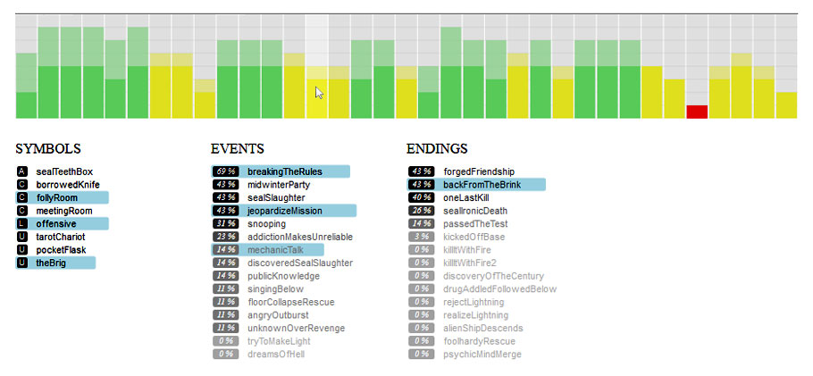
There’s a lot of information condensed into this, so let’s break it down:
- Each vertical bar represents one combination of active symbols.
- The top of a bar (the lighter bit) shows the number of endings activated by this combination. The bottom of the bar shows events.
- If the combination for a bar fails one of the “good amount of content” rules, it’s yellow. If it fails both, it’s red.
- All possible symbols, events, and endings for this particular build are shown below the graph
- The %s next to events and endings tells us what percentage of this build’s combinations involve those texts.
- If you hover over a symbol, event or ending, it lights up the bars involving that text, showing all possible configurations of symbols in which that element is present.
- Conversely, if you hover on a bar (like in the picture) it lights up the texts active for that particular symbol combination.
- If you click on a text, the graph re-sorts so that all bars involving that text move to the left, allowing you to see if that text in general needs to be associated with more combinations, or if that symbol doesn’t have enough triggered events and endings for it.
That’s a lot, right? What it boils down to, though, is that by just clicking around a bit, we can quickly answer questions like “do most combinations have enough content?” or “if I’m adding content, where’s the best place to add new content?” or “is that thing I just added getting used enough?”.
But there’s more…
There’s a problem, though. Because you can build an Ice-Bound level many different ways, we author more symbols for a level than there are “sockets” to put them in. That’s how we ensure levels can adapt based on what stories the player has built in the past. But this adds to the number of possible per-level builds.
It gets worse, too. For maximum flexibility, we also have a large pool of what we call “global symbols”, which can go in any level. They’re really tricky to write, but are at the center of what makes Ice-Bound deeply responsive to player input, so they’re also super-important. But because of them, there are even more possible per-level builds.
How many are there? Depends. Currently, one level with eight sockets and a three-symbol activation limit has ~5,000. Another level with nine sockets and a four-symbol limit, though, has ~50,000 possible builds. You could hit refresh and re-load that bar graph, but the graphs differ widely depending on the symbols involved, and pressing a button 50,000 times is considered in general a bad workflow.
Browsing Problematic Builds
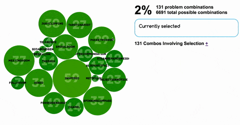
To tackle this problem, we came up with a second visualization tool. We started with the idea that of all possible builds, the ones we’re most concerned with are those with “red bars”, which have at least one combination of active symbols that doesn’t produce enough events and endings.
Since this generally happens because a certain symbol isn’t connected to enough events/endings, we categorize these problem builds by symbol, using a bubble graph:
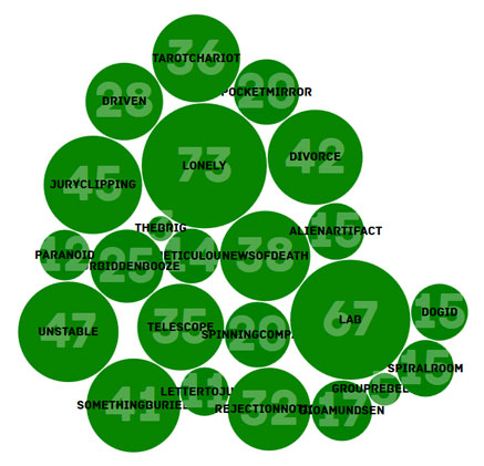
There’s a couple things going on here:
- The black labels are the symbol names
- The number / size of the bubble is how many “problem builds” the symbol is involved in
- The color reveals what percentage of all possible builds involving that symbol are problematic…traffic light style. Green = good, red = bad. If a symbol doesn’t trigger enough events and endings, it will be redder, indicating it needs to be a trigger for more content (or more content should be written that involves it).
That’s pretty good, but what if I want to get more specific? 73 combinations involving “Romantic” doesn’t tell me much. Fortunately, this viz is also interactive. Clicking on any bubble rearranges the graph to show only the distribution if the symbol you clicked stays active. So drilling down looks something like this:
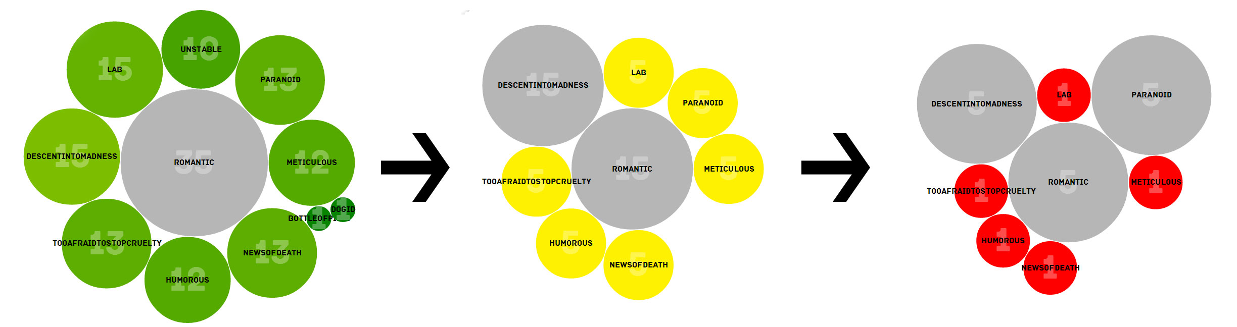
This helps you explore a pretty complicated space of possibility by using two criteria: shoot for big bubbles, and shoot for red bubbles.
You might need a bit more info though. So there’s also a panel:
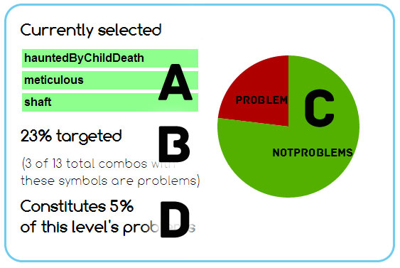
This tells us that:
A: we’re looking at all combinations involving these three symbols
B: there are 13 total combos with these symbols, 3 of which need content. So if you’re adding content with these three symbols as triggers, it’s 23% effective (because you’re also adding content to things that have enough content, which we’d like to avoid if possible)
C: here let’s make that a pie chart so you don’t have to read numbers all the time
D: let’s keep it in perspective too, so how much of the total combos needing content are we hitting if we author stuff for these?
So for the picture I gave, you could look pretty quickly and think “huh…looks like I should maybe de-select one of these symbols and see if I can find a combination with a higher ratio, so the content I author is more effective”.
That’s…complicated.
Yes. But the feedback is fast and rather immediate. Crucially, these two visualizations are linked together, so clicking on a specific build in the second viz loads the first viz with that build, so you can move from a generic “problem build” to teasing out the exact cause of the problem. Essentially this lets us have a troubleshooting workflow like this:
- Hey “Lonely” is a big bubble. Is it a little more yellow than the others? *Click*
- Huh, yeah. Oh look…”dogId” is bigger than these others! *Click*
- Cool. Let’s try “shaft” *Click*
- Nooope. All the circles are tiny now. *Click to de-select*
- Eh…that’s pretty good I guess. Ratio’s pretty high. Let’s look at a sample level build with that combo *Click*
- [bar graph viz loads] Yeah, I should totally write two events with “Lonely” and “dogId”…maybe with a “not iceAx” so I don’t hit these others, since they look pretty good
So that catches everything?
Not everything…but short of more complicated, involved visualizations, it does the job pretty good! Tools like this help us navigate the “combinatorial wilderness”, and make sure we have enough content to cover all our bases, without requiring that we write a thousand novels of text.
Thanks for reading! If you want to read a more technical write-up, you can check out our paper on the viz tools from the 2014 Foundations of Digital Games. We also want to give a shout-out to Melanie Dickinson, who worked with us in summer ’13 and was instrumental in getting the viz tools off the ground!
Our Ice-Bound Kickstarter is in its final days, and our next stretch goal is open-sourcing the narrative engine behind the game, including these tools. Help us make it happen by becoming a backer or spreading the word online via Twitter, Facebook or your communication network of choice.